Corporate Identity
Corporate Identity

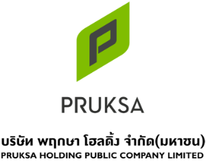
This particular brand mark has been designed to reflect characteristics, images, way of thinking and core operating principles that convey brand images, vision and other components that form the “Pruksa Holding” which is aligned across all areas of operations.
Betterment, Increasing
In this regard, the design of this brand mark was adapted from the shape derived from the combination and integration of international artistic components which reflect the being of “PRUKSA HOLDING” in different perspectives; through the blossoming leaves, budding from the tip of the stem. This signifies the beginning of lives; reiterating the fact that the Company’s business is related to living and accommodations.
Living
The shape of the roof is reflective of warmth, safety and lives under the roof of a strong and reliable house.
Growth, Fresh
The shape of the roof is reflective of warmth, safety and lives under the roof of a strong and reliable house.
Major standard colors of the brand mark are bright green and dark red. The bright green color reflects the Company’s name and its objective in operating the business to provide meaningful lives to those involved. The dark red color signifies the Company’s and employees’ spirit and enthusiasm in operating the business with earnestness and honesty.
All in all, this brand mark aims to convey modernity and brightness of lives, as well as development and growth in every aspect, determination to success both for the management of the organization and employees to deliver the best quality to all stakeholders.
